UX UI Project
Star Plan buy flow enhancement
Star Plan was a new mobile plan introduced by StarHub. Unfortunately, conversion rates have not met expectations. Based on data and customer feedback, our hypotheses include unclear value proposition, lack of information about the plan, and customer tendency to visit stores for purchases instead of buying online.
Role:
• UX lead • Facilitator during user testing

Drop-off rate on App is higher than expected.
How might we improve customer confidence in buying Star Plan to reduce the drop-off rate and increase conversion rates?
Problem statement
Discovery
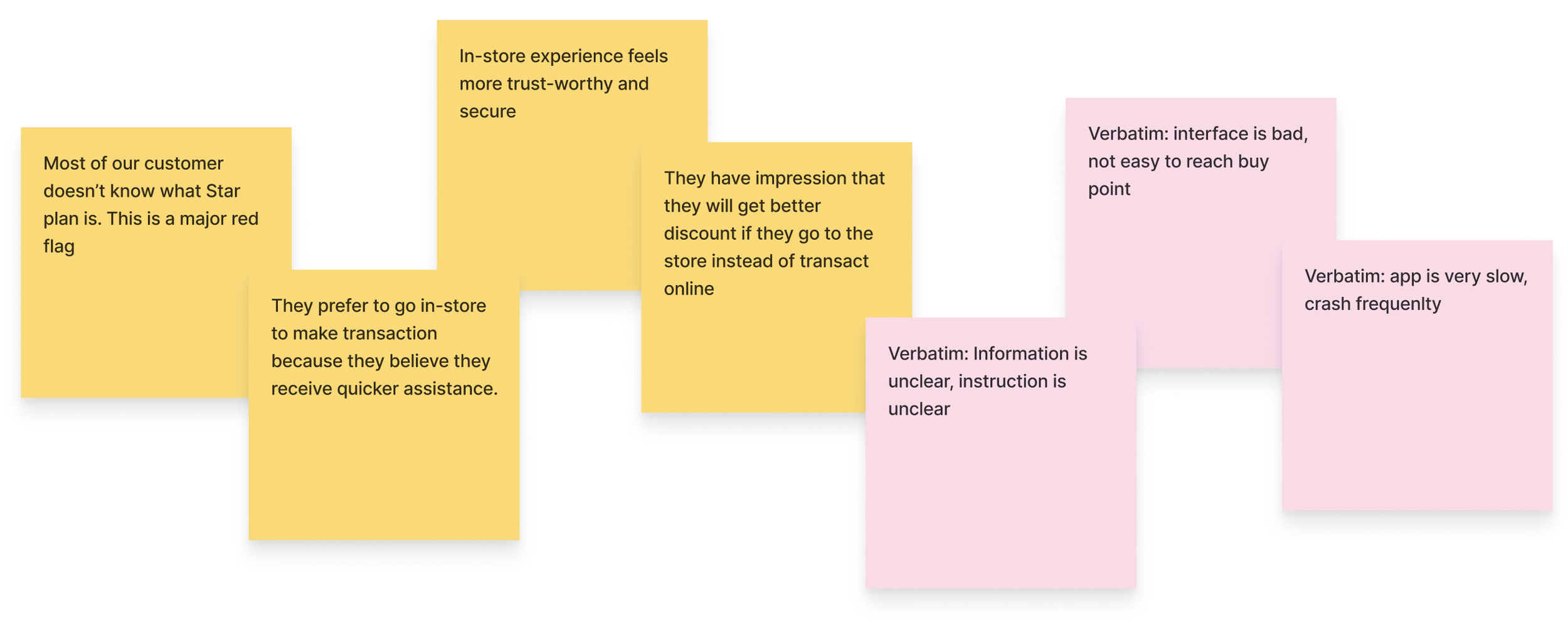
Kick-off with available research data & verbatims
Prior to this project, the research team had conducted research that was closely related to our problem statement. I worked closely with one of the researchers to gather insights from the previous research and collected information from various teams regarding Star Plan.
As we studied the data, we identified several key points. While not all were related to UI/UX issues, they provided strong evidence that we need to identify gaps and make improvements.

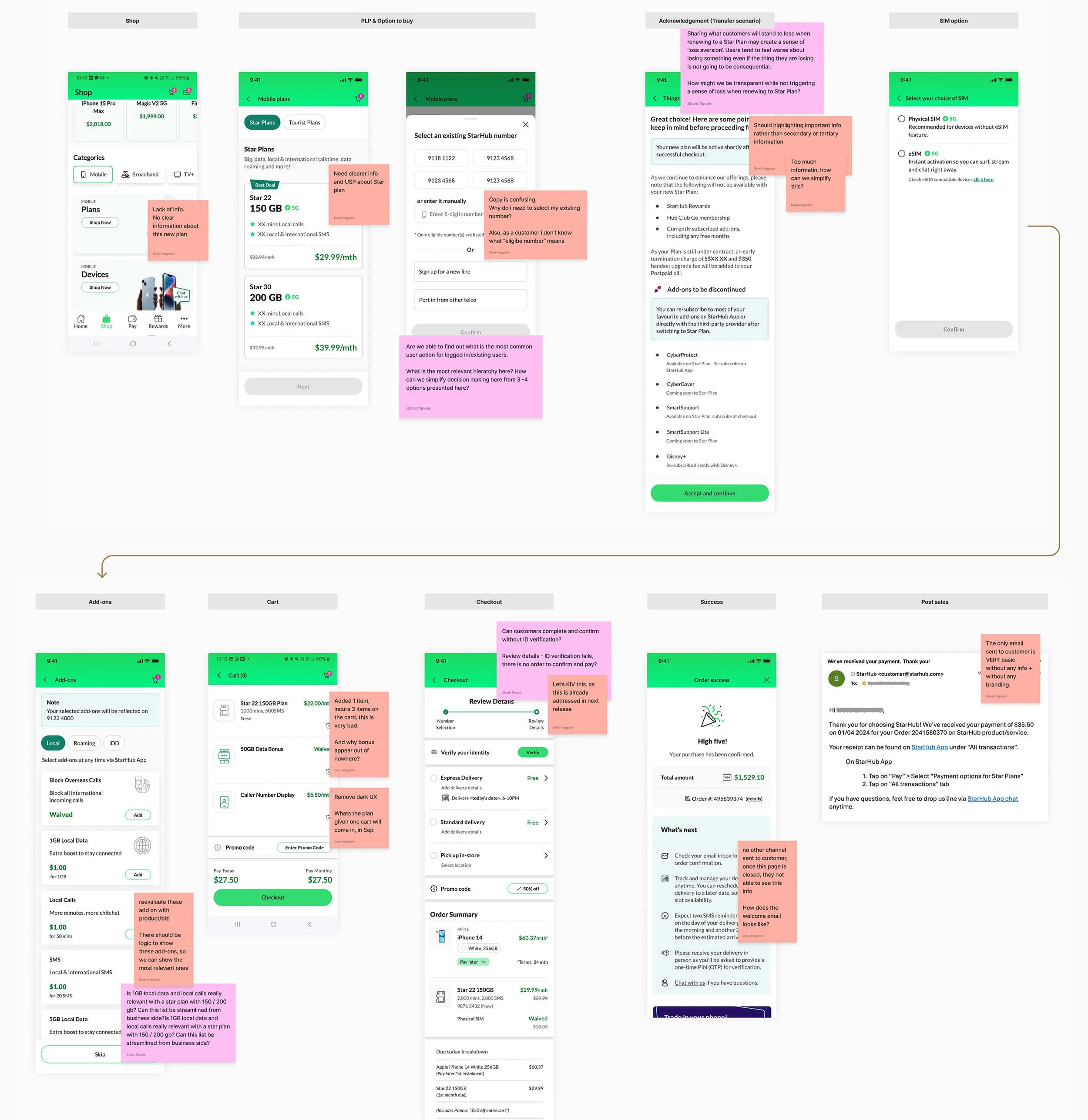
Audit current flow
We reviewed the current buy flow and screens to identify gaps in the user experience and found almost every page violates design principles, which is very concerning. We placed post-its all over the screens highlighting the issues and our recommendations. Some of the crucial issues are listed below:
Product information is indeed lacking, which explains why customers say information is unclear and prefer to visit stores for further questions.
Copywriting not well thought through, this leading to ambiguity for some and too much information for others
Spotted a dark UX on cart
Incorrect visual cues for ongoing campaign, leaving confusion to users
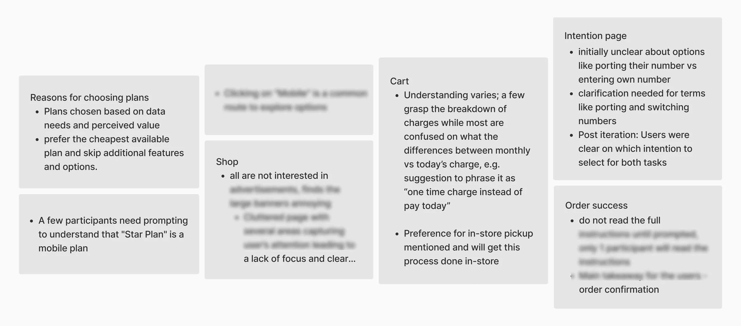
Findings
Design & Testing
Alignment for user testing
We shared the findings with stakeholders, who unsurprisingly echoed many of the same concerns. To ensure alignment before moving into prototyping, I walked through the suggested enhancements and here are the highlights:


Moderated user testing
1st iteration
We worked closely with Marcomm and product owner to enhance the message.
Loading prototype…
After moderating 6 participants, there were no major red flags for most pages. Some insights are:
Unfamiliarity with Star plan still persists, but copy under the title is very helpful.
The majority of participants briefly read the acknowledgment page, but when prompted, they explained it’s because they see it as just a testing, not something that would impact their actual plan.
Participants tend to overlook information on the success page, expecting details to be sent to their email.
Check out the prototype on the right.
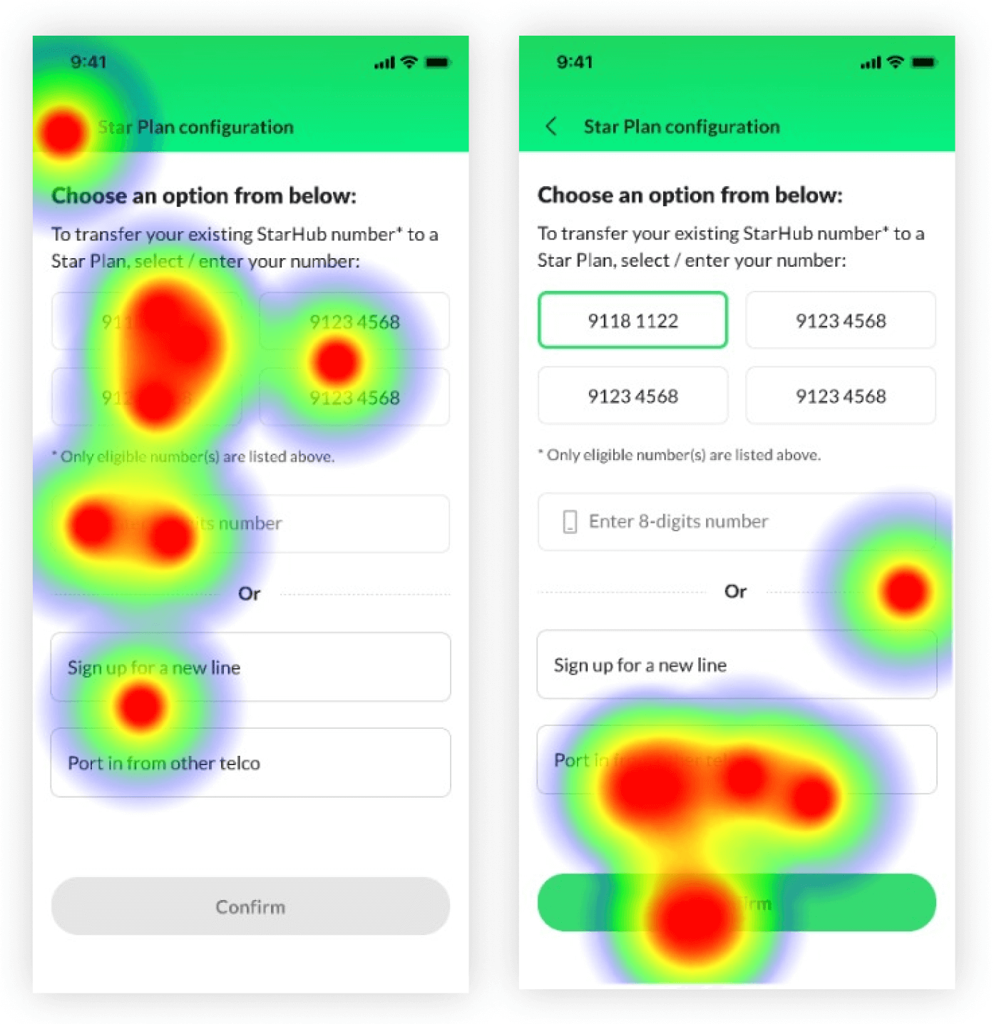
1 significant red flag was that all participants struggled to understand what they need to do on the purchase options screen, and user testing shows:
Multiple options on the same page create friction, leading to misclicks and confusion.
Participants often missed the copy under the title and focused on the options, resulting in a lack of context that left them confused.
1st iteration: multiple misclicks and confusion
2nd iteration
We decided to make a quick 2nd iteration on the spot. My suggestion was to introduce 2-steps action: first, choose an option, second, select the number, to reduce concurrent decisions in one page.
We tested this version with another 6 participants, and results showed a significant improvement in decision-making on the page. From the heatmap, we can see that friction is significantly reduced.
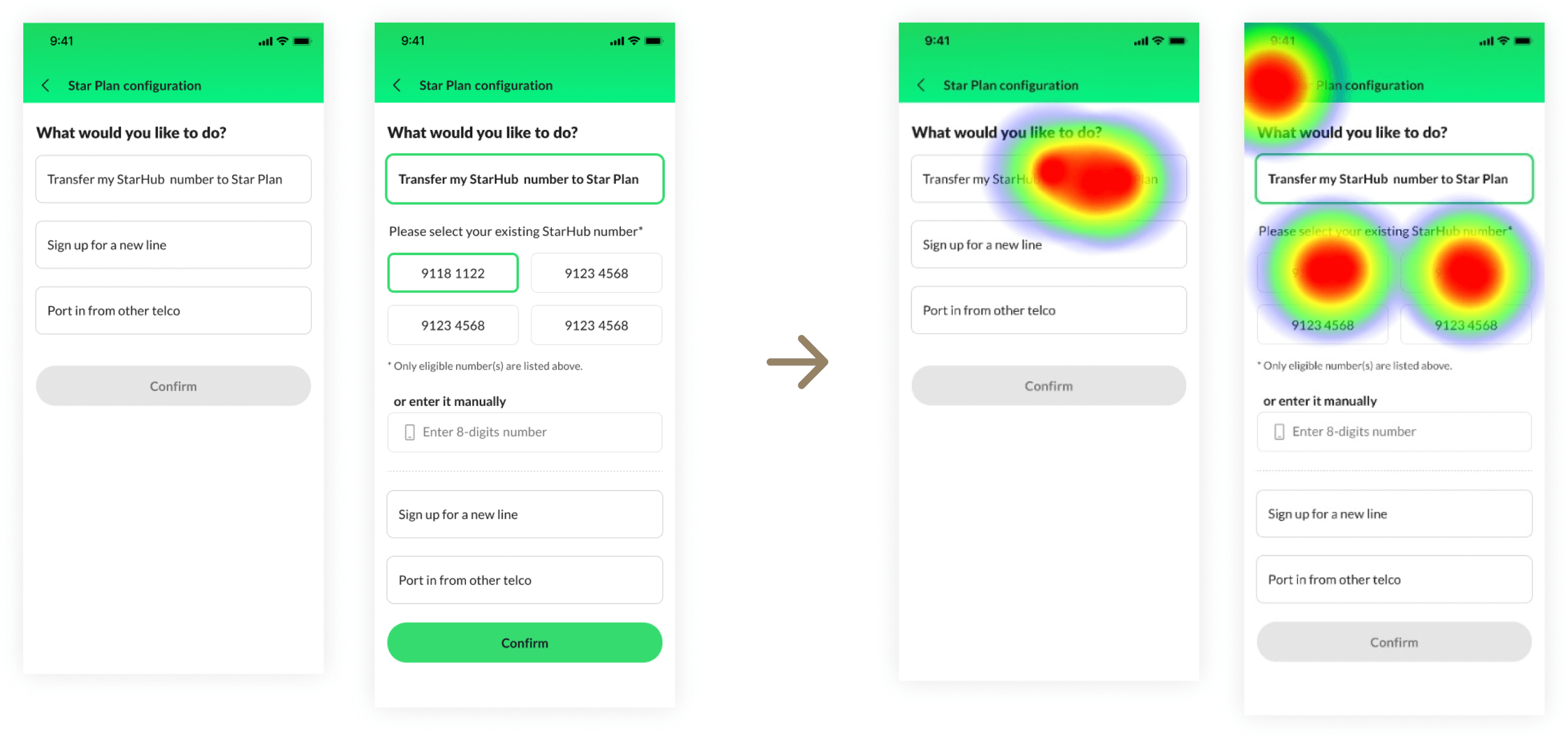
2nd iteration: friction significantly reduced
Deliver
Synthesize and recommendations
Findings from synthesized raw data


Prioritize for MVP
As we had to rush the project to stop losses, for the MVP, we focused on enhancing the pages that showed the most friction during user testing. Those are the intention page, where users choose their purchase option, and the acknowledgment page for plan transfers.

Post UT updates and additional recommendations
Results
Reflection and impact
There were definitely more areas we wanted to fix; this phase focused on quick wins within a tight timeline. Even so, after monitoring the first month, data analytics show a significant increase in traffic and a positive trend in engagement.
It's encouraging to see that the small improvements are already making an impact and we’ll definitely continue rolling out the rest of the enhancements along the way.
+2.4%
-4%
Dropoff rate
Click-through rate
Quick links to other projects
-
SafeHub+
UX UI Project
-
Travel App (AI prototyping)
UX Case Study
-

ANZ Rewards
UX UI Project
-
Rewards Dashboard
UX UI Project