UX Case Study
Oasis-Overseas Assistant App (AI Prototyping)
With the rise of AI driven prototyping tools that turn ideas into functional real-life prototype almost instantly, I revisited this project that was originally created in 2019 to explore AI capabilities and assess how it can accelerate design workflows. Jump to 2025 update section

Oasis was created from my upset feeling over an unfortunate experience when I lost all my valuables during a vacation in Switzerland in 2019. The lack of information on what to do and where to go only amplifies stress levels. With information scattered across various sources, finding the right one is time-consuming and confusing. Furthermore, language barriers with the locals make the situation even worse.
About the app:
Oasis is a personal emergency guide with a core function to help users handle stressful moments with ease, providing ways to handle emergency situations with up-to-date information - like an assistant, to give travellers peace of mind, as everything they need is in one app.
Bad experience turned into ideas
While I was at the embassy to settle my situation, an officer told me about an app for Indonesian travellers, which provides helpful information for travellers in situations like me. After browsing through the app, I found few useful features, but it lacks many important aspects, such as:
No information about the embassy's operating hours, just a phone number.
Travellers don’t know that the embassy provides emergency services on weekends - which very important for me at that moment.
Numerous unnecessary features for travellers.
The news section is not up to date.
And many more.
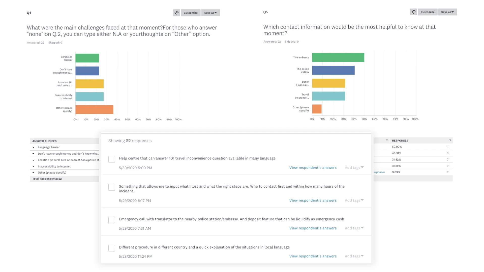
The combination of my experience and these findings inspired me to work on this project. I started off by creating a simple survey to understand travellers' pain points and challenges when they encountered travel inconveniences.


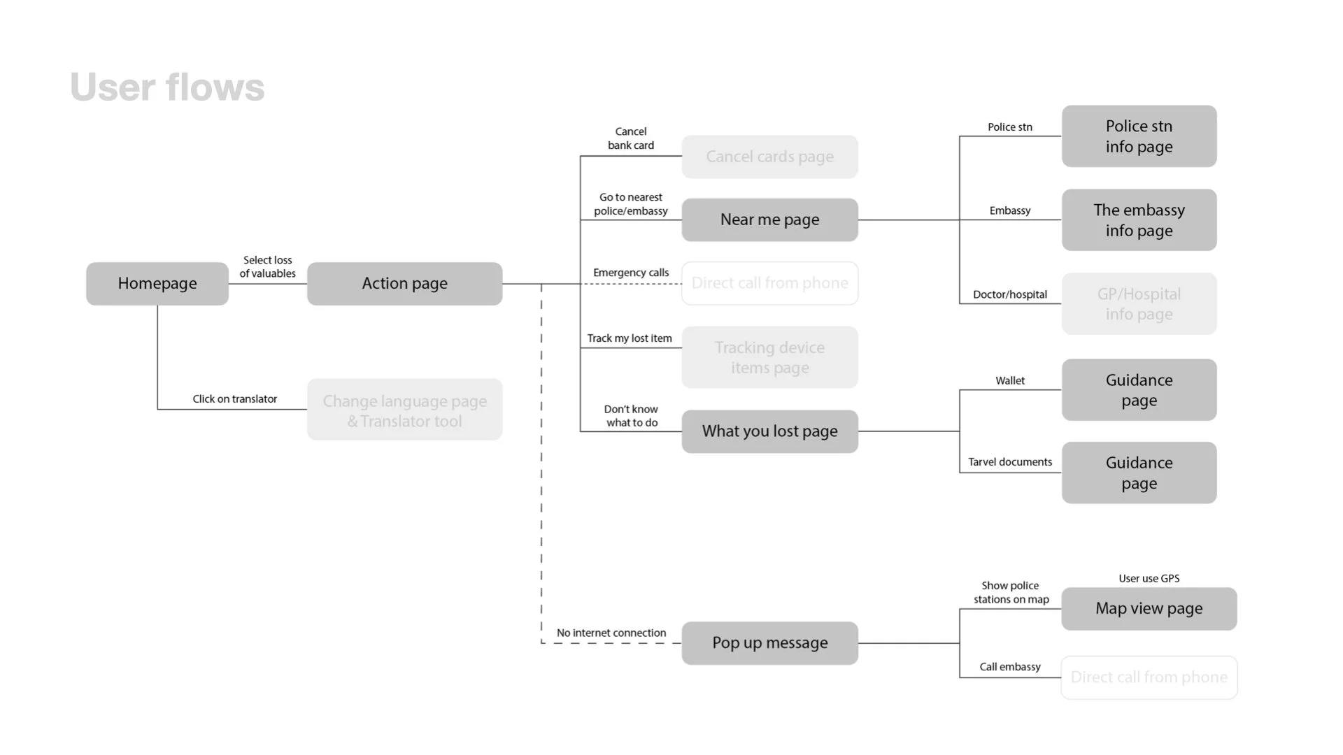

User flow and wireframes
After analyzing the survey responses and reflecting on my own experience, I identified some key features that could be crucial in order to reduce the hassle or at least lighten travellers’ mental burden. These includes:
Easy access to important documents
Quick link to access users’ documents to settle emergency situations.Direct access to emergency contacts
Direct line to the embassy helpline or nearest police station for immediate assistance.Guidance to solve issues
Step by step information on what to prepare, what to do, and where to go.Getting immediate help
Chat with fellow Indonesian in the country/city, allowing user to ask for urgent help.
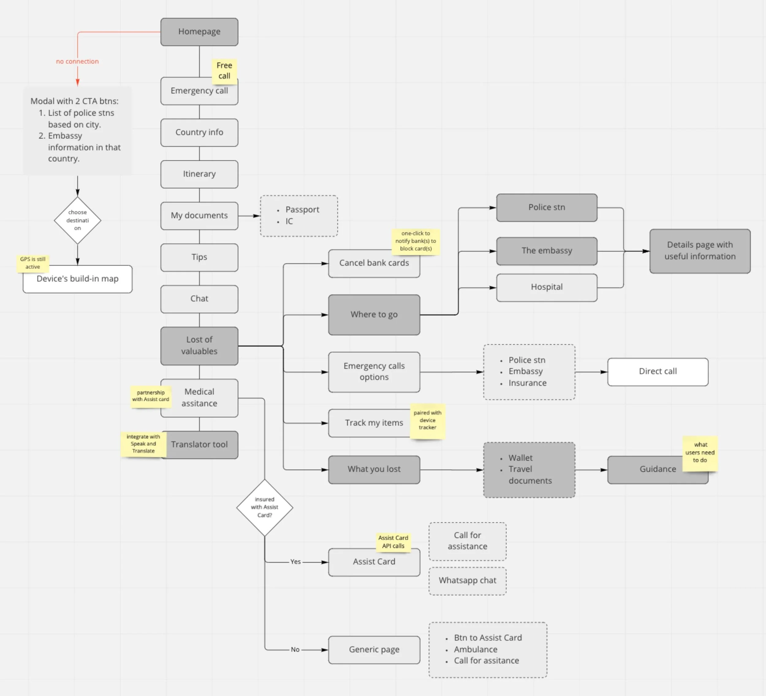
Learning points
As I was working on the wireframes, I started to realize that some features were redundant or might not necessarily valuable as I initially thought. For example:
Loss of valuables page
Since the steps for losing wallet and losing travel documents are very similar; I could combine them into one guidance page with a clear indication on which steps to skip, reducing extra clicks.Homepage
Menus such as County info, Tips and Explore are essentially fall under the same category, they provide useful information about the country. I could have merged them into one main menu with sub categories to avoid users’ confusion.
It also opens up rooms for further exploration to create a rich and even better experience. Some ideas that came to mind include:
Money withdrawal
Prodiving immediate financial assisstance when travellers lose their wallets and have zero cash.Free local call
Potentially partnering with local telco provider to enable free local calls for tourists in emergency situations.Travel concierge
Expanding the app feature to a broader travel needs, not only focused on high-risk travel inconveniences.
AI exploration (2025 update)
Why revisiting this project?
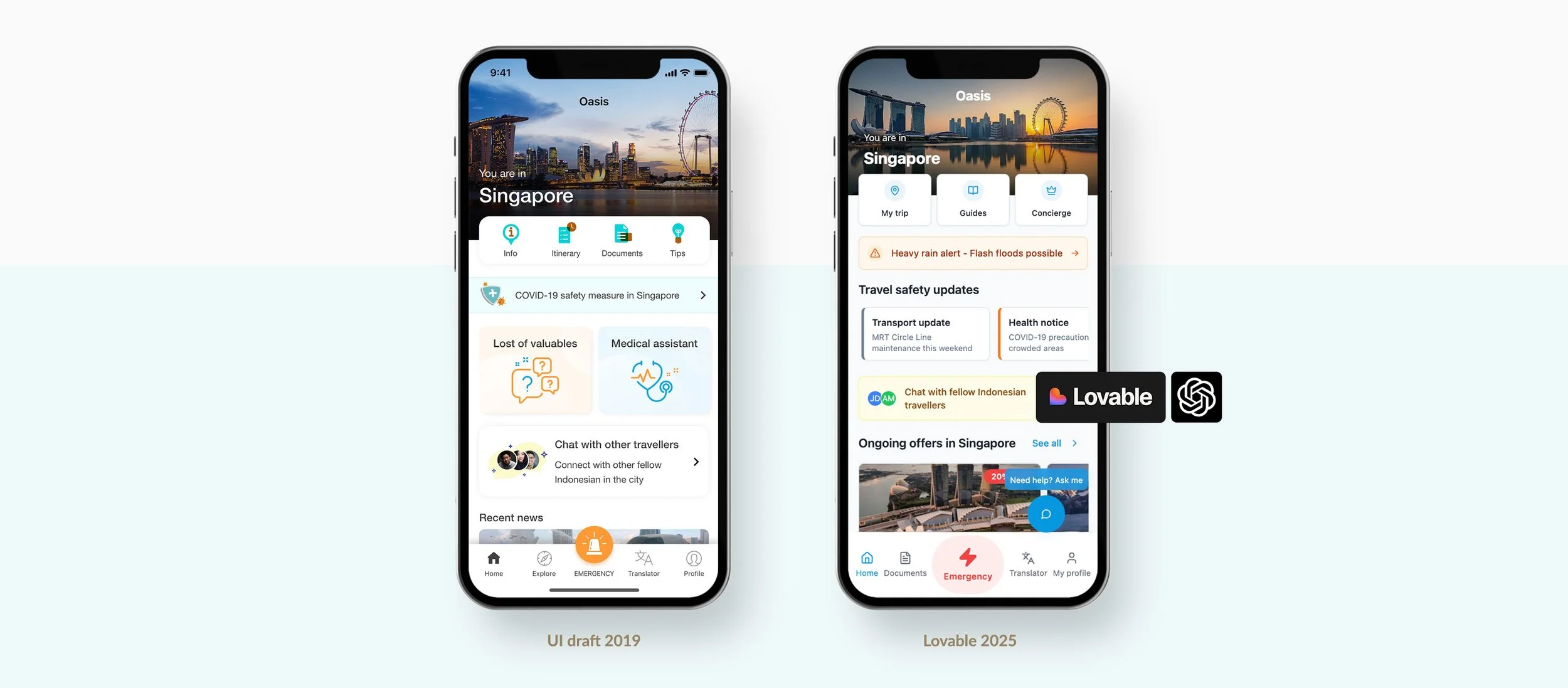
AI has evolved significantly since I first created this project in 2019. With the rise of AI-powered design platforms, I wanted to explore how quickly an early concept could now be transformed into a functional, high-fidelity prototype.
Exploring AI platforms
I tested 2 platforms - Lovable and Emergent, both are powerful, with their own pros and cons. After a few trial prompts, I decided to continue with Lovable because it felt more straightforward and convenient. I also used ChatGPT to refine my initial prompt, making it more structured and so Lovable had enough context to generate a more accurate prototype.
Building with Lovable
Once I get the desirable refined prompt from Chat GPT. I began my process in Lovable, and keep adjusting and iterating with prompts until I arrived at a prototype that matched the idea I have in mind.


Outcome and takeaway
Speed
The first version was generated in less than 3 mins, and it took only a total of less than 30 mins to the latest iteration on the right, includes second-level pages with dummy data pulled from open sources/APIs.
Observations
While AI is powerful, without careful prompting, AI often places elements in ways that make sense to the system but not necessarily to humans.
Reflection
AI significantly accelerates design process. It can definitely reduce time spent on manual prototype creation, allowing designers like me to focus more on refinement, validation, and delivering high-quality outputs.

Change to mobile view on desktop or open the link on your mobile phone for best viewing.
Quick links to other projects
-
SafeHub+
UX UI Project
-
StarHub mobile plan
UX UI Project
-

ANZ Rewards
UI UX Project
-
Rewards Dashboard
UX UI Project