UI UX Project
Loyalty program rewards dashboard
Ascenda’s core product was its end-to-end loyalty solution. This solution includes a wide range of products such as Points Transfer, Gift Cards Redemption, Redeem Cashback, and many more. With such a broad range of products, it enables Banks (our clients) to offer their customers engaging and enjoyable ways to earn and redeem points.
Problem:
The loyalty products were originally designed and developed in their own separate applications. As a result, the overall visuals were inconsistent, and some experiences were not smooth/broken. We need to design a unified, end-to-end rewards platform experience and a homepage to support business development team with their sales pitch (practical and efficient for demo purposes).
Given the broad scope of the project, the design process below only focuses on the Dashboard.
Roles:
• UI lead • Hands-on UX
Research & Ideation
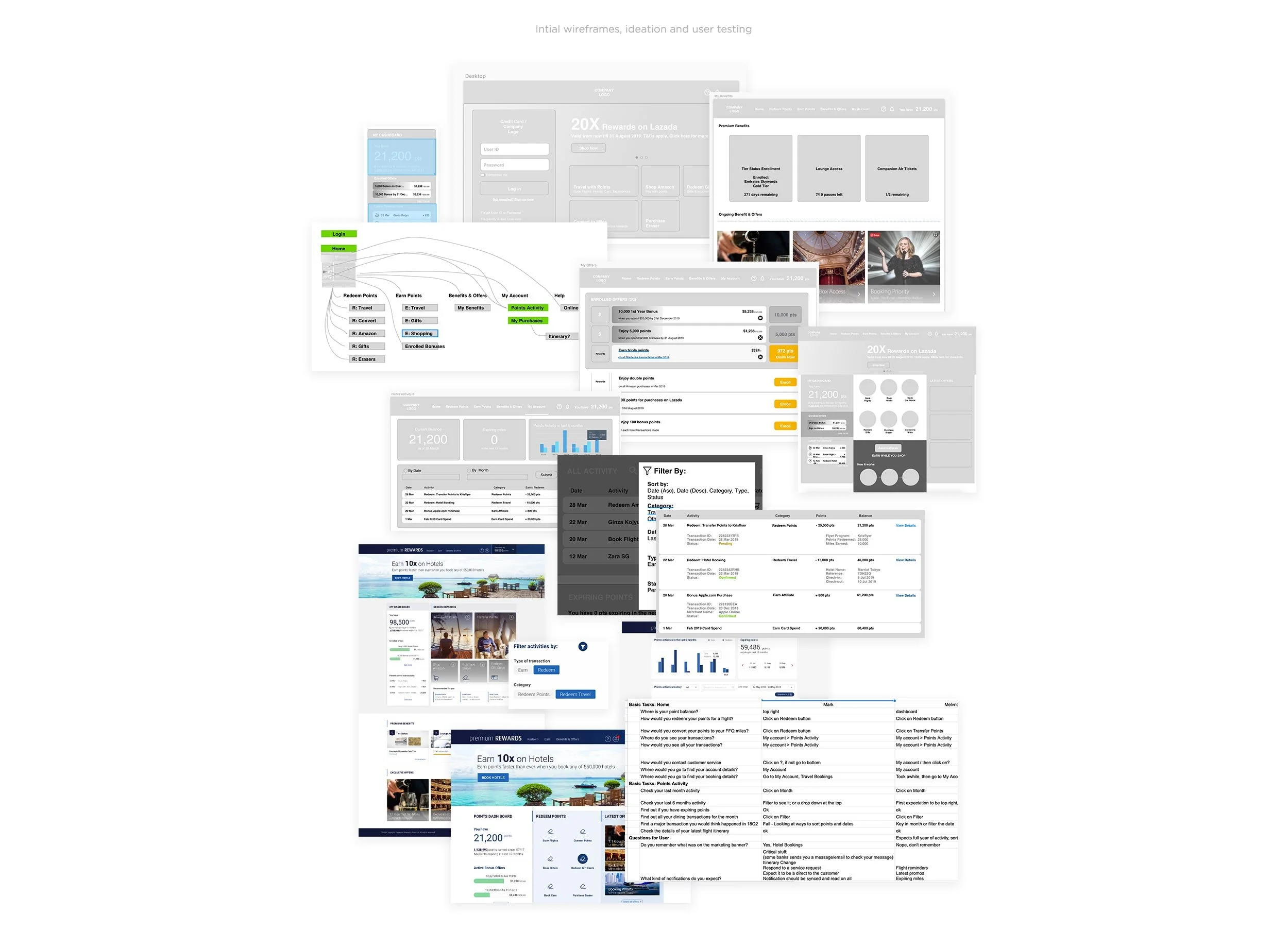
I worked closely with the Product owner (Desmond) to assess the existing product flows, identify gaps and opportunities, brainstorm the concept, create the site map, and develop wireframes.
To meet our goal of delivering the design within 2 months, we split the work streams once we aligned on the concept. I focused on kickstarting the UI components, while Desmond continued refining the wireframes for our weekly discussions with stakeholders.
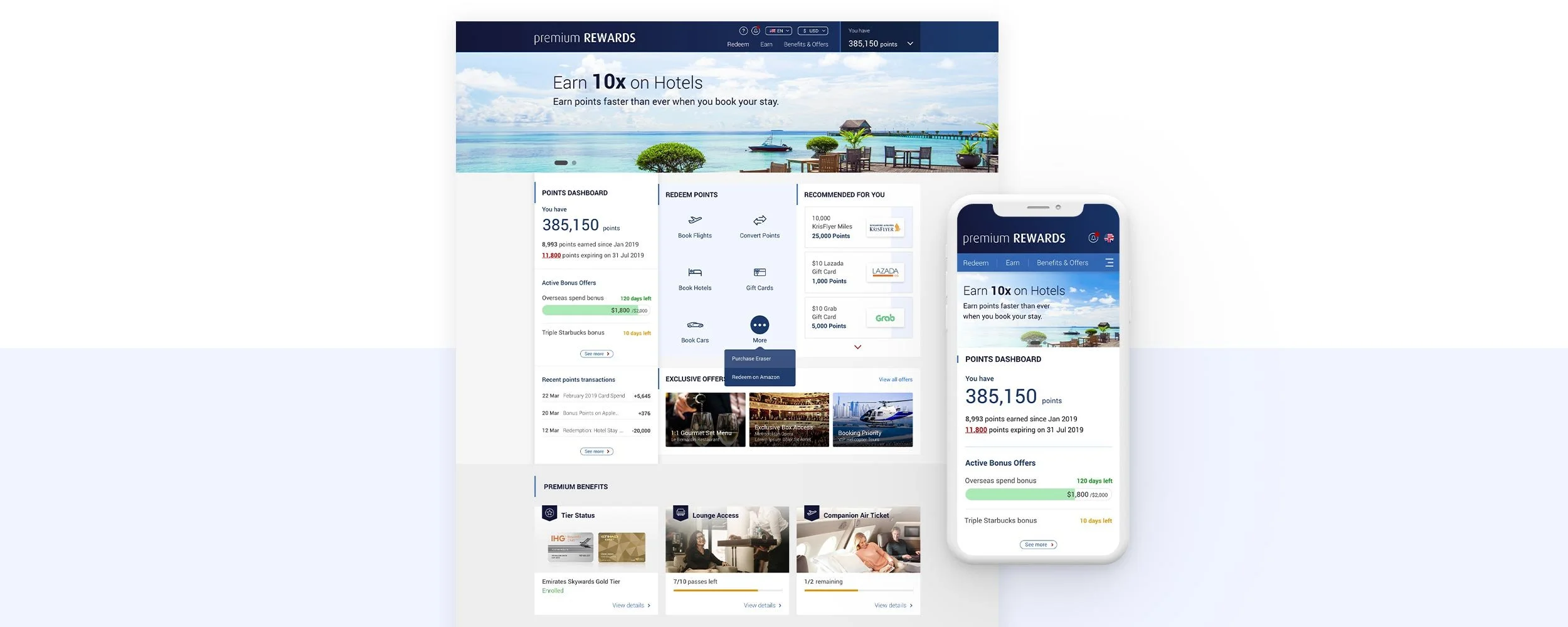
Dashboard corner for a quick overview
One of the most anticipated features was the dashboard corner on the homepage. It gives users a quick overview of their recent points activity and rewards progress, without extra click. User can then click to view the full dashboard, where they can trace the details of their points activities.
In line with dashboard design best practices, we adopted visual aids such as charts to help users easily understand their earnings and redemptions across different categories. Additionally, some rewards are tied to milestones that need to be unlocked. To support this, I used a progress bar to clearly indicate users' progress in unlocking the rewards.

User testing
Throughout the process, we did research, refined the wireframes, and conducted simple user testing to validate key flows–especially component on the dashboard. Five of our participants were colleagues from other departments and friends who were familiar with bank rewards but had minimal knowledge about our products - providing us with fresh, unbiased insights.
No significant issues were identified during testing. Participants find it easy to navigate, view their activity history, filter transactions, check expiring points and find their redemptions intuitively. Since the MVP would be launched to a smaller customer base, we decided to proceed with the design and monitor its performance post-launch.
Learning & takeaways
As our client base grows, we realized that their needs varied significantly. Therefore, standardizing the dashboard design for all clients is not ideal. For example, depending on the client’s product setup, elements like charts and progress bar might not necessarily important or useful to their customers.
On the other hand, for the homepage, it needed to be simpler and more aspirational for demo purposes. During pitching stage, detailed UX is far less important; it is more about creating a strong impression by showcasing a broad range of features and capabilities. With this in mind, I redesigned several user journeys and the homepage experience.
The following video is the final demo version. All of the product redemption flow showcased in the video were implemented in actual development for clients such as ANZ, BNZ, OCBC, and many more.
Quick links to other projects
-
SafeHub+
UX UI Project
-
Travel App (AI prototyping)
UX Case Study
-

ANZ Rewards
UX UI Project
-
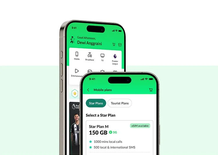
StarHub mobile plan
UX UI Project