UX UI Project
SafeHub+ discovery page and buy flow enhancement
SafeHub+ is a comprehensive suite of innovative safety and security products offered by StarHub.
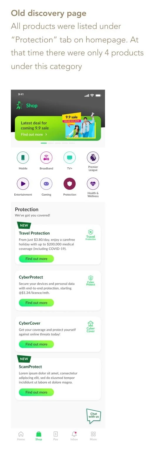
As more products were added to the suite, the original visual approach becoming less effective - many products were somewhat hidden. SafeHub+ needs a more scalable way to showcase its full range of products and offerings, so it can better support business growth.
During my investigation, I also found concerning user experience issues. So I took this opportunity to enhance the buy flow as well to improve the end-to-end experience.
Role:
UX UI main designer
Investigate to understand more
The former name of SafeHub+ was “Protection”, which was simple and easy to understand. However, with this name change, there is a lack of introduction & explanation about what SafeHub+ is and the products offered under this suite. This resulted in fewer visitors, and that also means low sales.
While I intended to conduct thorough research and user testing, due to time constraints, I was unable to collaborate with research team. Instead, I arranged sessions with product owners to better understand the problems and the objectives. From those sessions, we defined a JTBD, and I created a simple table summarizing findings and opportunities.
Discover & Define

Current design has a similar UI pattern, but inconsistencies in the buy experience
When StarHub launched the revamped App in November 2022, only some of the legacy SafeHub+ products were migrated to the new version. To minimize friction, I observed that the PDPs were designed to match the structure and layout of the new App design, however, I noticed inconsistencies in the buy flow, particularly in the crucial funnel from PDP to checkout, which negatively impacts the user experience.
As I studied the flow and screens, I made annotations with questions and points to clarify with product owners. I worked closely with them to gain a better understanding and compiled a list of concerning issues:
UI components are not intuitive. For example, some cards appear clickable when they are actually not.
Information on PDP is not clear at first glance. It requires an extra click to see essential details.
Content is not carefully thought through. For instance, upselling irrelevant products on PDP.
While content looks structured, it is not very informative, especially for more complex products, such as insurance.
Products in the legacy system open an in-app browser which breaks consistency with the other products.
Wireframing
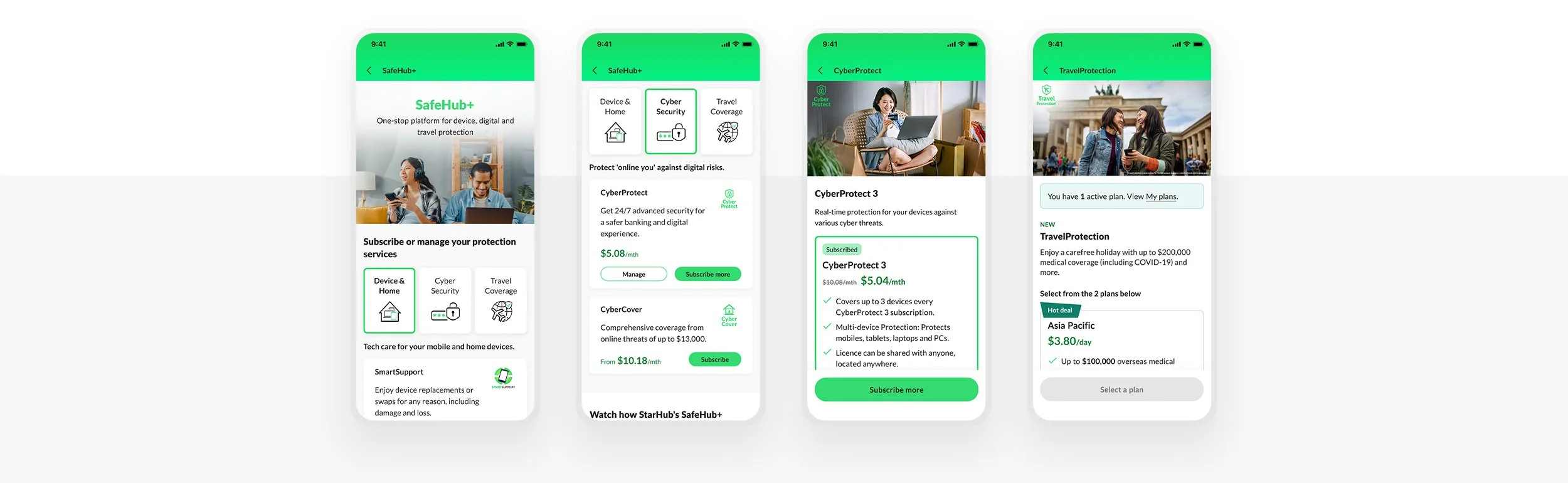
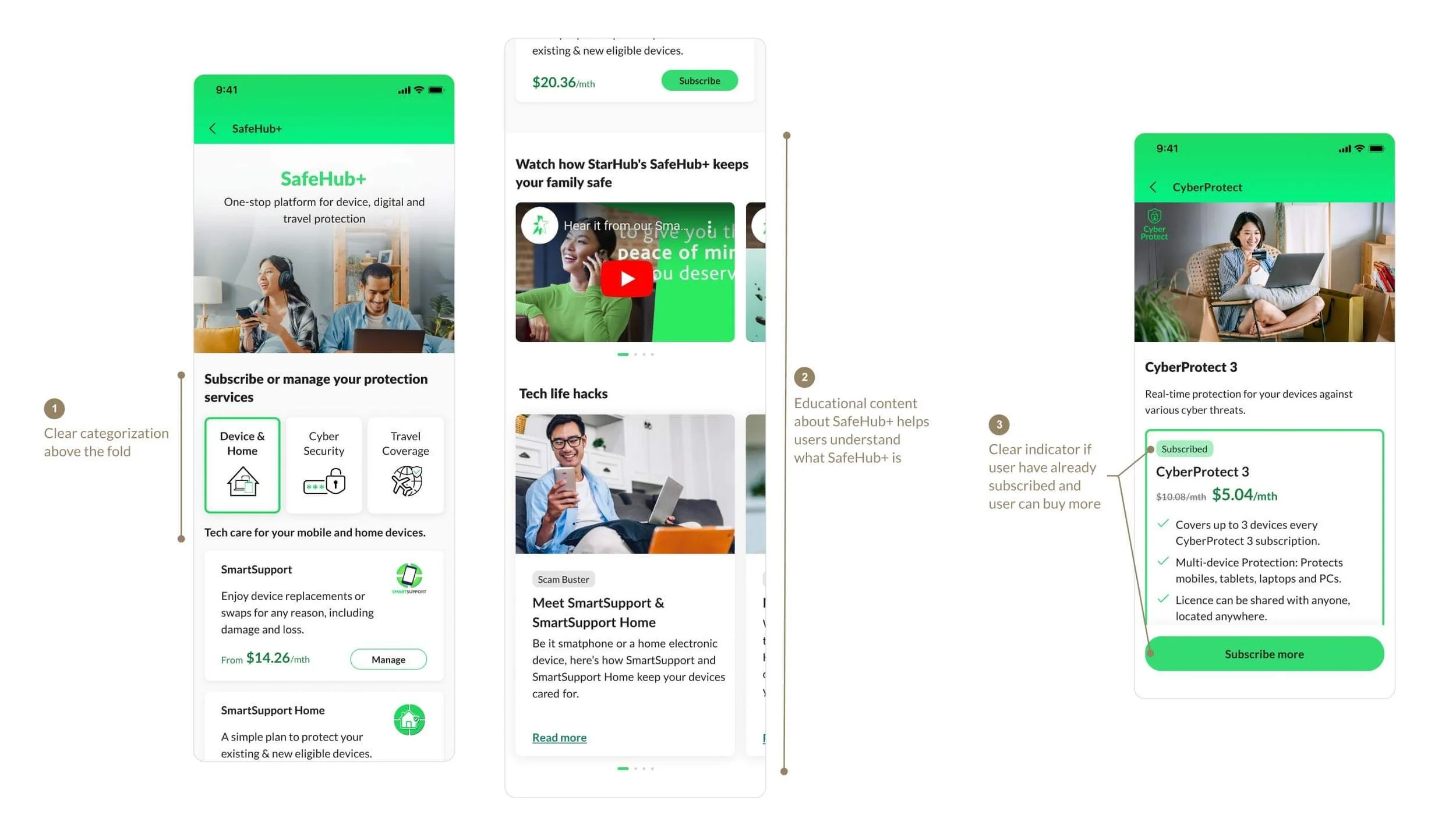
The ask was simple: to design an informative discovery page for SafeHub+ where users can easily find brief information about each product. However, I wanted to design something more engaging.
I created some wireframes and presented my ideas to key stakeholders (App team, Shop team, Product team) to gather feedback. One idea I proposed was to show status of users who had already subscribed/purchased, along with personalized message inviting them to subscribe/purchase more. Unfortunately, there were several concerns around potential API call issues, performance and development time. As a result, we ended up moving forward with a simpler version for the MVP.
Ideate

Solution & Impact
Final design & enhancement


The results
While I may not have the data on overall sales, the average number of visitors across all products, especially during the peak period, has increased by 13%. This indicates positive customer engagement as compared to the previous design.
Check out the interactive prototype on the right. In this prototype, you can try subscribe to CyberProtect or purchase TravelProtect.
Loading prototype…
Quick links to other projects
-
StarHub mobile plan
UX UI Project
-
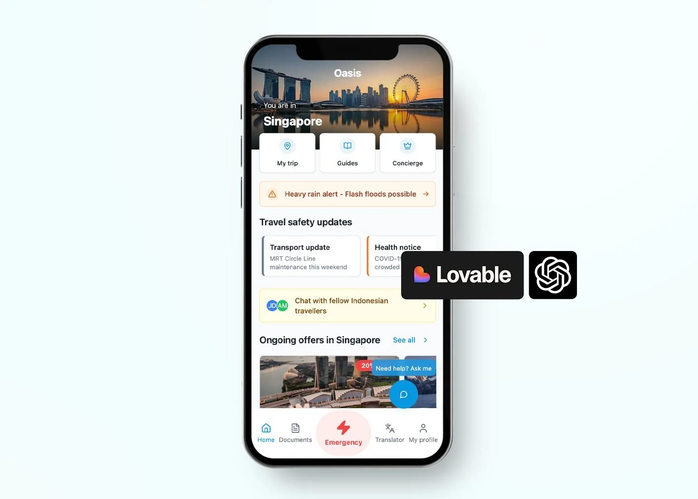
Travel App (AI prototyping)
UX Case Study
-

ANZ Rewards
UX UI Project
-
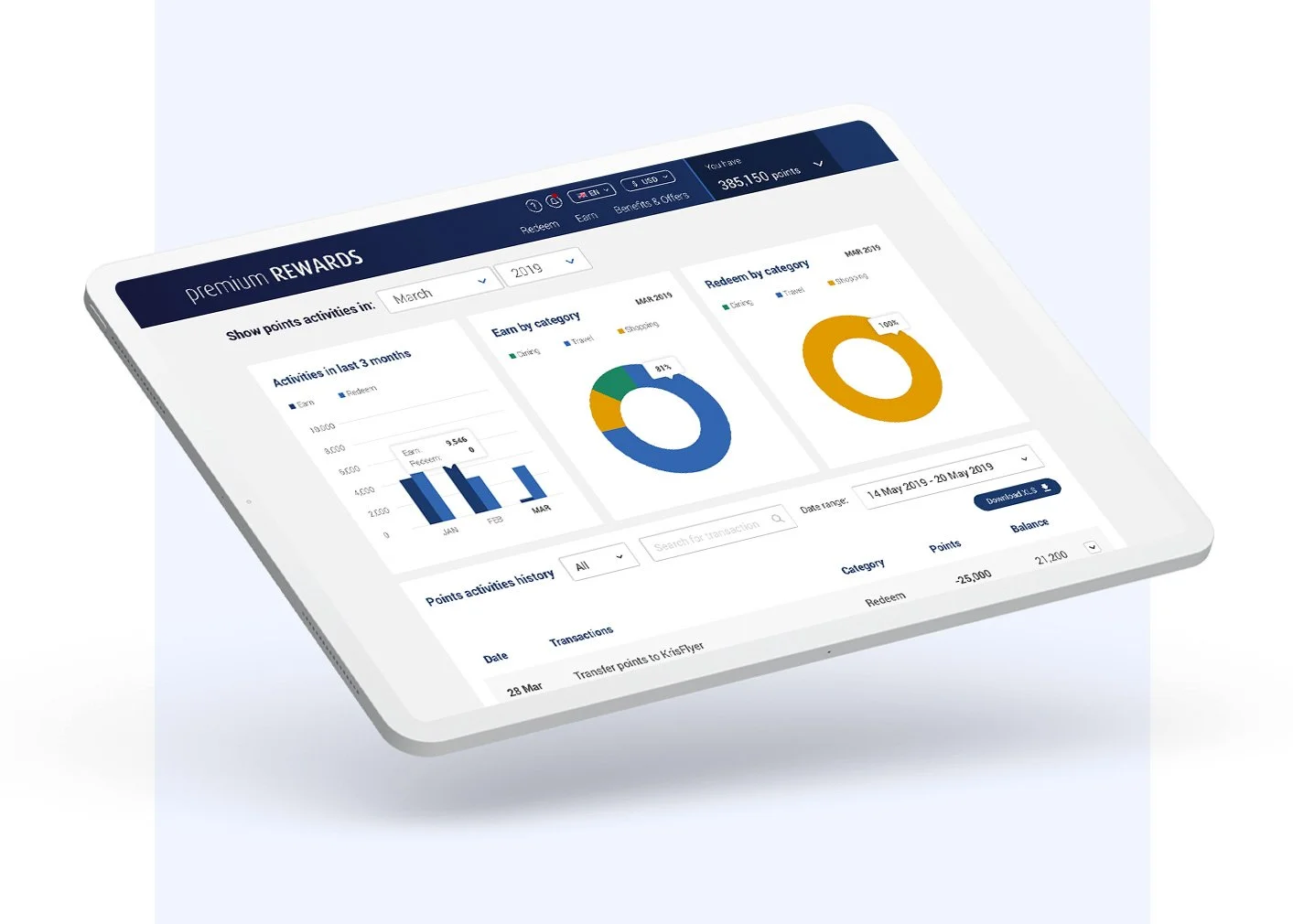
Rewards Dashboard
UX UI Project